CMYK vs. RGB: Understanding Colour Modes
Learn why colours look different on screens versus printed flags, and how to get the best results for your custom prints.
Why Do Colours Look Different on Print?
When designing custom flags or promotional banners, one of the most common questions we receive is why a colour looks different on a physical fabric compared to a computer monitor or phone screen. This is due to the fundamental difference between the two primary colour models: RGB and CMYK.
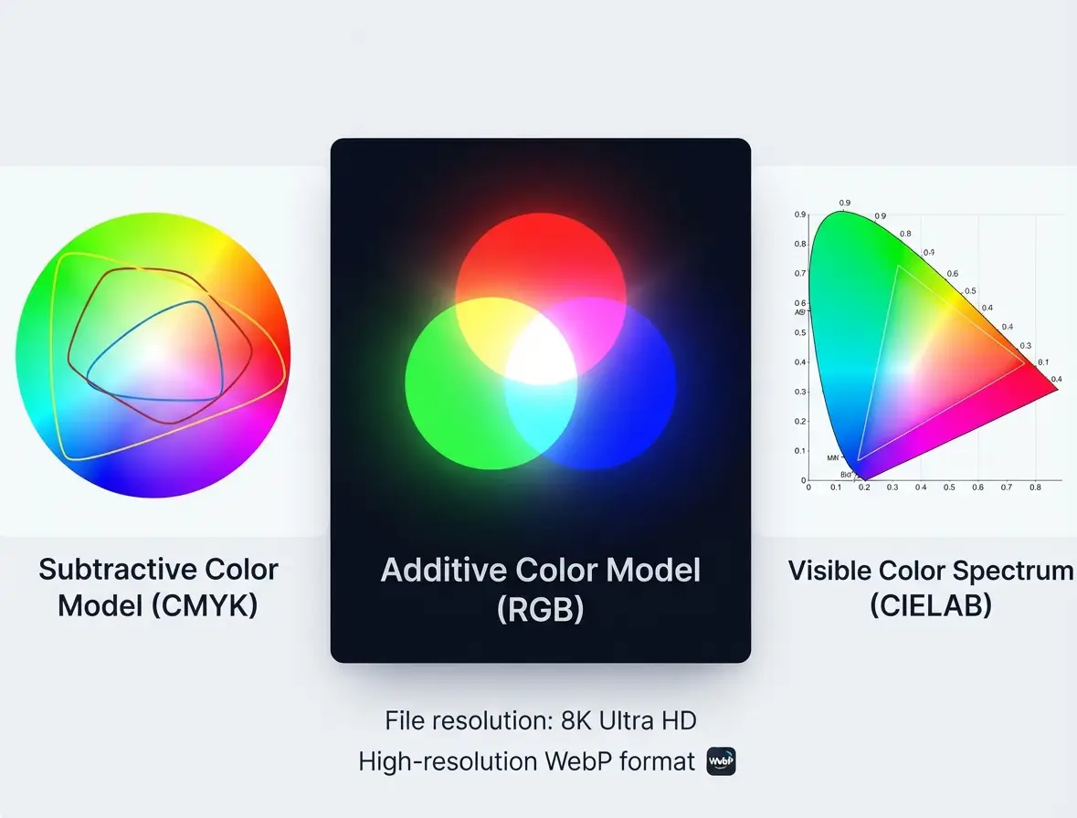
RGB Colour Model: Additive light used for digital screens. (Click to enlarge)
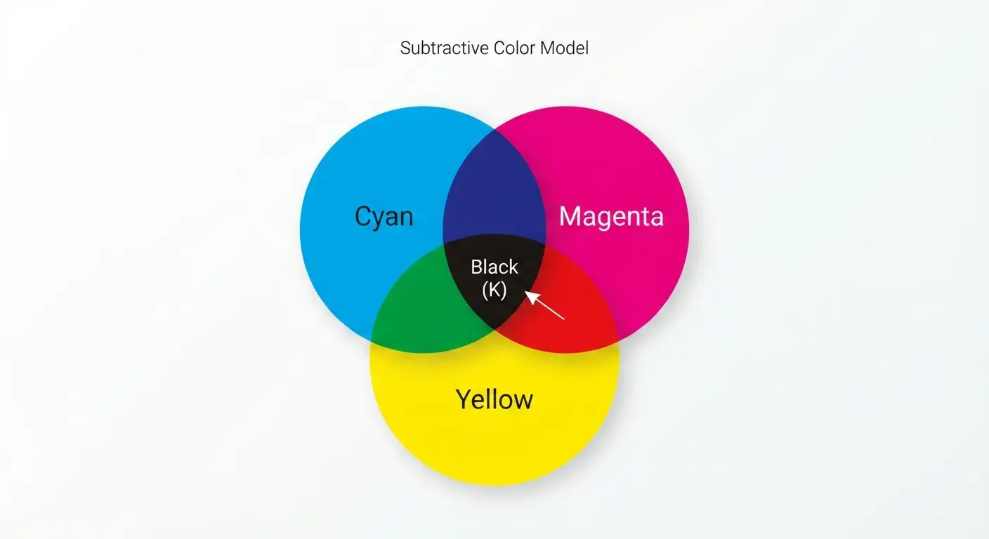
CMYK Colour Model: Subtractive inks used for printing. (Click to enlarge)
1. RGB (Red, Green, Blue) — For Digital Screens
RGB is the colour space used by electronic displays such as computer monitors, smartphones, and televisions.
- How it works: It is an additive colour model, meaning colours are created by combining beams of light (Red, Green, and Blue) on a dark or backlit background.
- Colour Range: RGB has a much wider colour gamut, meaning it can display vibrant, glowing, and neon hues that physically cannot be replicated by standard inks.
- Best used for: Web design, digital graphics, photography, and screen viewing.
2. CMYK (Cyan, Magenta, Key/Black) — For Printing
CMYK is the standard colour model used for physical printing processes, including silk screen printing and dye-sublimation flag printing.
- How it works: It is a subtractive colour model. Inks printed on white fabric absorb certain wavelengths of light and reflect back the rest. Mixing Cyan, Magenta, Yellow, and Black inks absorbs more light to create various colours.
- Colour Range: Because it relies on physical pigments reflecting ambient light rather than emitting artificial light, CMYK has a slightly narrower gamut than RGB. Extremely bright neon shades may look slightly more muted or deeper when converted to print.
- Best used for: Custom flags, banners, flyers, packaging, and all tangible printed merchandise.
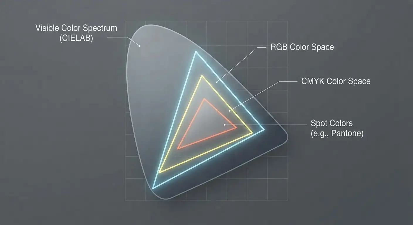
Comparison showing how the CMYK colour gamut fits within the broader RGB and human visible colour ranges. (Click to view high-resolution image)
Tips for Best Results on Your Custom Flags
To ensure your final products match your expectations as closely as possible, we recommend following these guidelines when preparing your artwork:
- Design in CMYK Mode: If your design software (like Adobe Illustrator or Photoshop) allows it, set your document colour mode to CMYK from the beginning so you can preview a more accurate representation of the printed output.
- Mind Bright Colours: Extremely bright or glowing neon shades chosen in RGB will automatically shift closer to their printable CMYK equivalents during production.
- Request Proofs: If exact colour matching is critical for your brand identity, feel free to speak with our team about digital or physical colour proofs before mass production.